Case 04 · Design systems
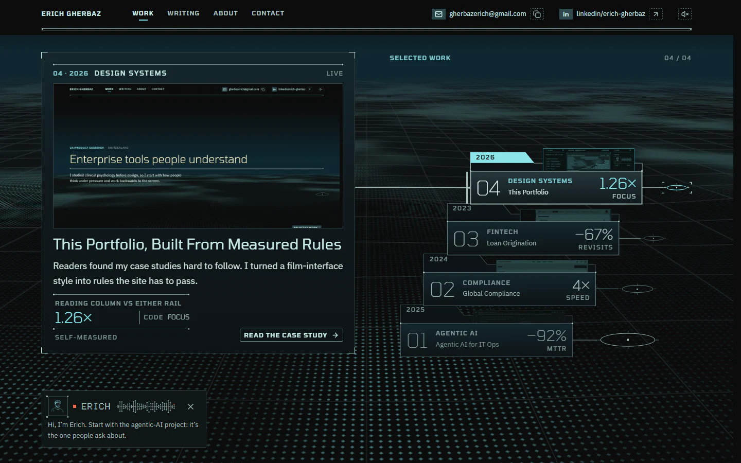
This Portfolio, Built From Measured Rules
In short
Problem
Readers found my dense case studies hard to follow.
What I did
I turned a film-interface style into rules the site has to pass.
Outcome
Reading column vs a rail
2.1×
Median
Lowest text contrast
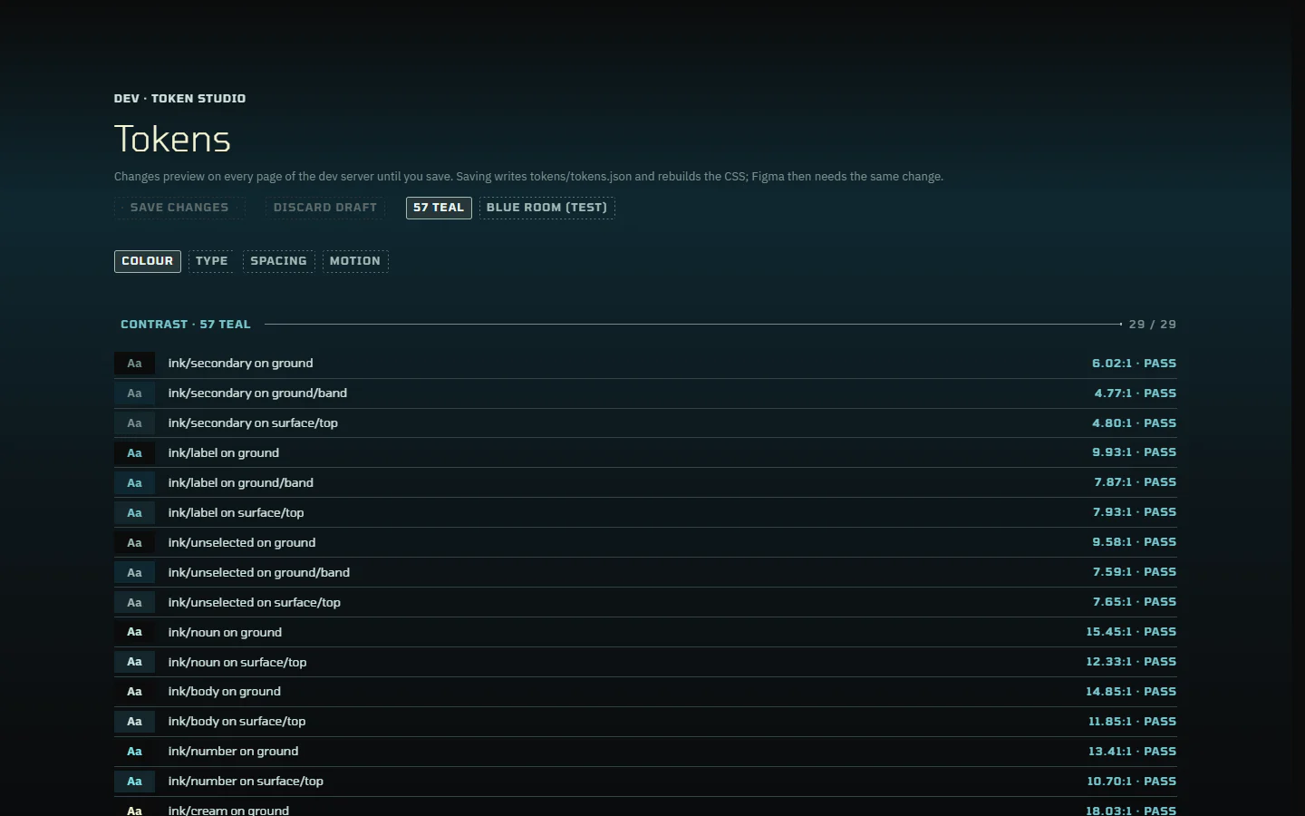
4.77:1
AA 4.5
- Personal project
- Designer · Researcher
- Research · System · Build
- Apr – Oct 2026
- With an AI coding agent
01Context
The first version was a game, and readers got lost in it
The first version told my cases as a game-like conversation, and readers found them hard to follow.
My work is enterprise tools: an AI that investigates outages, a compliance tool, a loan app used in the field. Each case is long and technical. The first version of this site, live in spring 2026, told them as an interactive experience: an illustrated me to talk to, questions to pick, text typed out line by line, a guided path walked with the arrow keys. When I tested it, readers found the cases hard to follow.
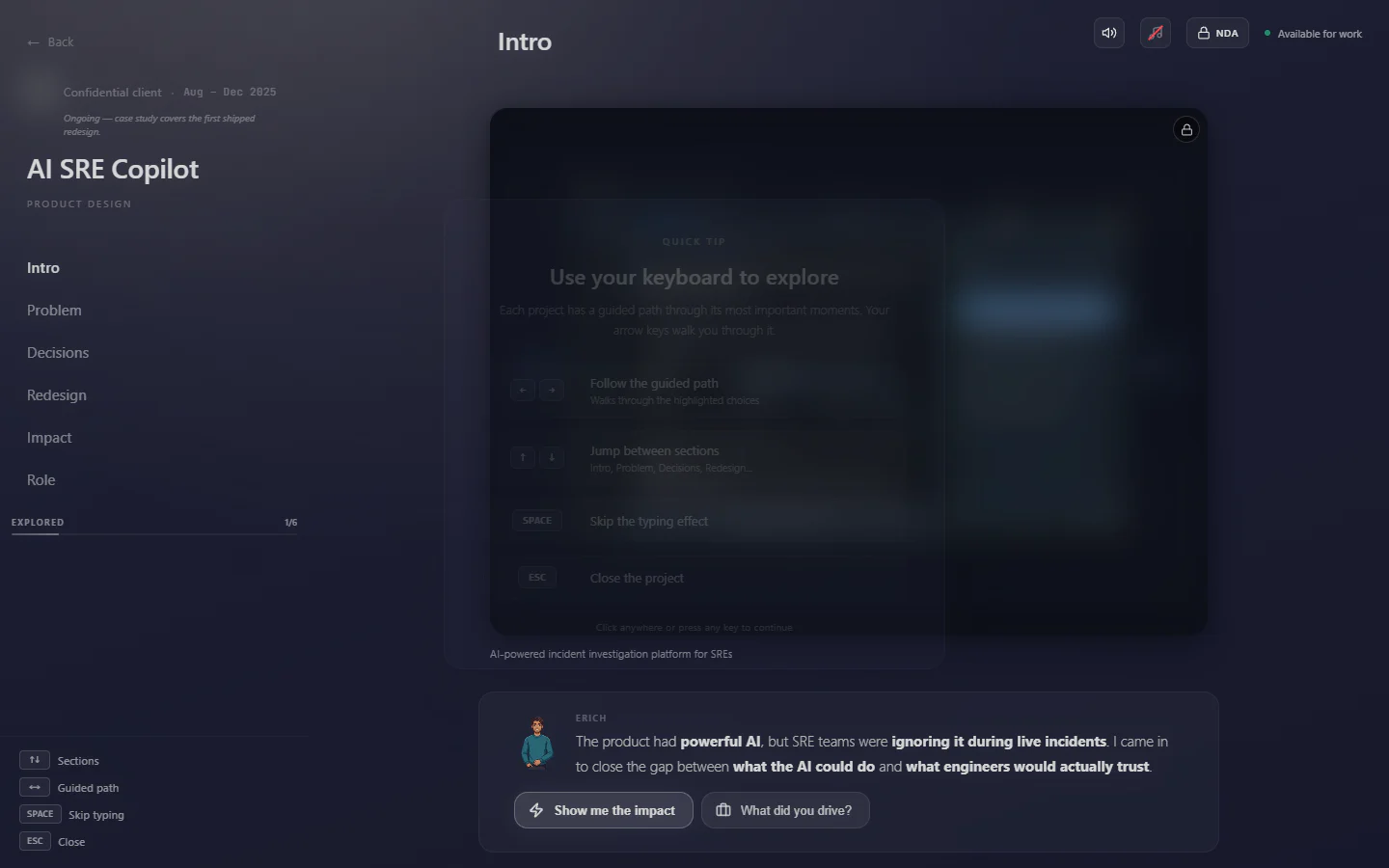
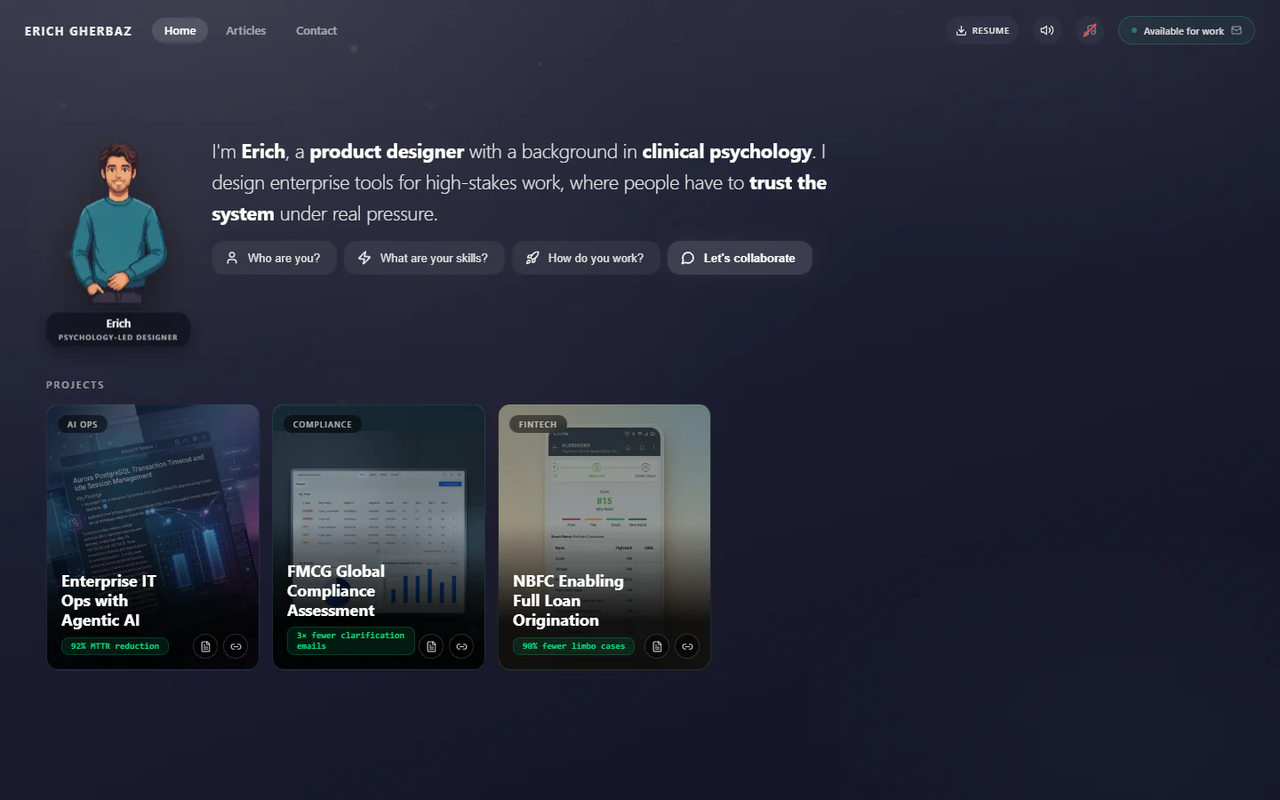
Version 2 cleaned it up, but the cases were still a conversation with an avatar.
A second version that summer kept the idea and cleaned it up, with real screenshots on the cards and articles beside the cases. The cases still came as a conversation with an avatar.
This version had to make long stories easy to read, and not look like a template.
So this version started as a reading problem. The site had to make a long story easy to take in, at whatever depth a reader has time for. And it still had to look like it was made by a designer, not picked from a template.
More detail
Who it's for
Hiring managers and design leads, often on a laptop between two meetings. They give a case a minute before deciding whether to read on.
So every case reads at three depths. Skim tells the story in about two minutes, Read is the case, and Full adds the deep dives. The depth is a switch on the page, not three separate pages.
02Research
Film interfaces, measured instead of copied
I reproduced twelve film-interface screens and measured them, instead of copying the look by eye.
I kept the dark ground and the voice, now a quiet line in the side rail, and dropped everything a reader had to play through. For the look, I wanted the feel of the interfaces designed for films: dark screens, thin rules, readouts you take in at a glance. But a style copied by eye turns into a generic dark theme. So I reproduced twelve of those screens in Figma and measured them: how much of the screen is lit, how many text sizes, how bright each tier of text is.
Each finding was graded: rules hold everywhere, defaults bend only with a reason.
Every finding got a grade for how sure I could be of it. A rule held on every screen I measured; a default held on most, and bending one needs a written reason. The rest were per-screen choices, the signature of one source, or decisions of my own.
13 rules
15 defaults
14 decisions of my own
More detail
Why grade the rules
A pattern that held on one screen and broke on another isn't a rule. Treating it as one would have pulled every page toward that one screen.
Grading kept the system honest about what it knew. The rules are fixed, the defaults bend with a reason, and my own decisions are mine to change.
03What didn't work
Following the rules still looked like a template
The first drafts followed the rules and still looked generic: everything had the same importance.
This version went through several drafts in Figma before any code. The first ones followed the rules, and still read as generic. A critique pass found why: everything had the same importance. Six lit chips used as headings, five ways to start a section on one screen, eleven text sizes, some of them one pixel apart.
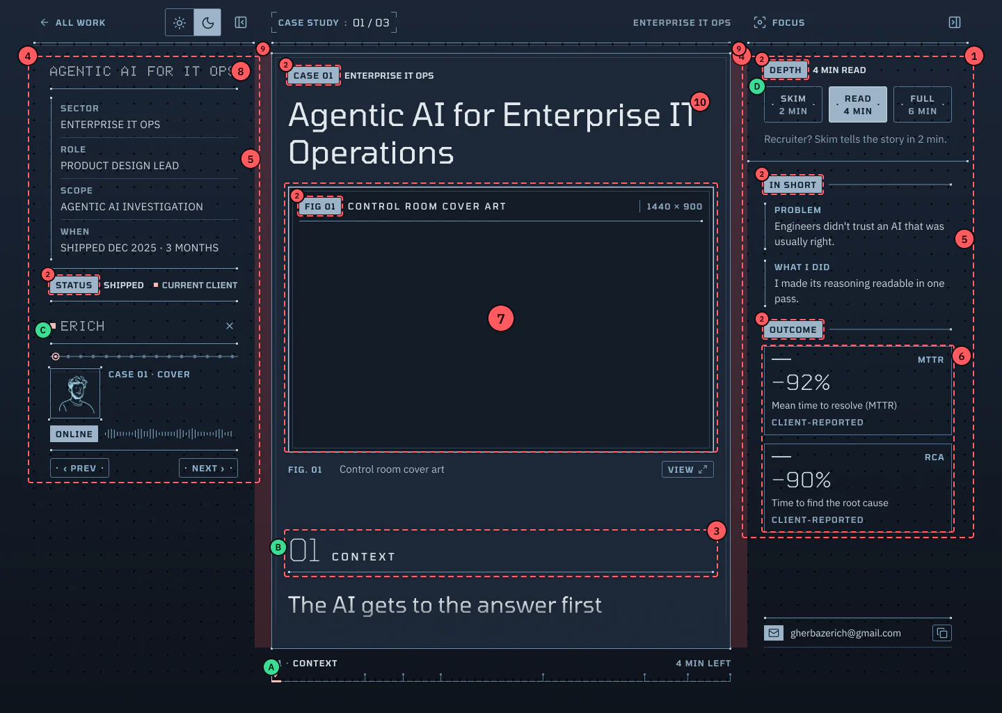
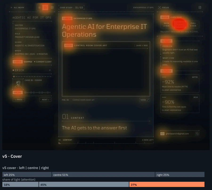
Measured: the right rail held 37% of the light on a quarter of the width.
To see it, I measured where the eye goes: the share of bright pixels in each column. The reading column took 45% of the light on half the width. The right rail took 37% on a quarter of it, and the brightest thing on the page was a button.
More detail
What rules can't do
Rules describe what the reference screens have in common. They can't say what a screen is about, so a screen that follows them can still have nothing to look at first.
From then on every screen had to answer three questions: what is it about, what does it have that no other screen has, and which details carry real information.
04Decisions
Hierarchy is a budget of light
The reading column must hold 1.2× a rail's attention. Dimming the rails did it; colour didn't.
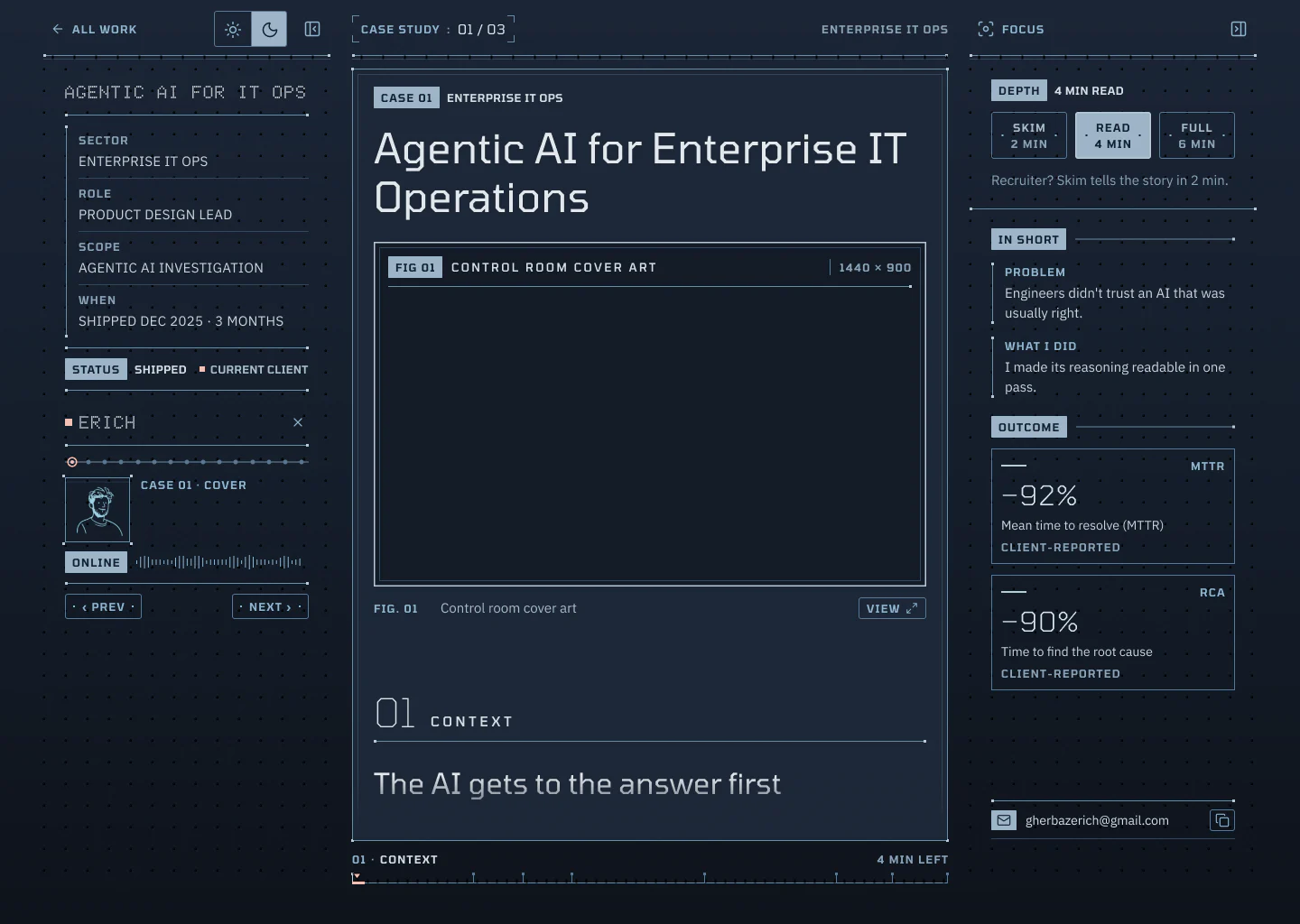
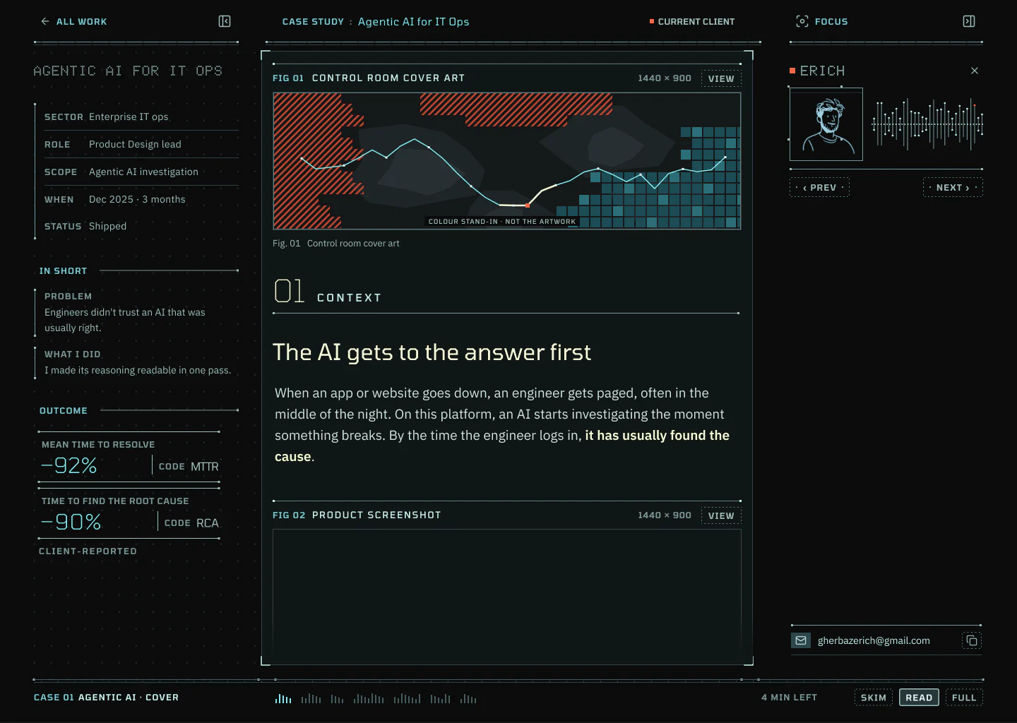
I set a target I could measure: the reading column holds at least 1.2 times the attention of either rail. Colour didn't get there; I tried four palettes and every one failed. What worked was taking light away from the rails: one ink tier dimmer, one size smaller, thin numbers, and the framed panel back on the reading column. Preview D was the first to pass, at 1.26.
Colour on objects, not text
Quiet buttons
One style for every diagram
05The system
Every rule is a check the build has to pass
One token file writes the CSS, and the build fails when a rule is broken.
Rules in a document drift. So every value lives in one token file that writes the CSS, and the build fails on a broken colour reference, text under 4.5:1 contrast, a size below the floor, or a raw value in a component's styles. The Figma variables are checked against the same file, so design and code can't quietly disagree.
Each page loads at most 90 KB of JavaScript, so it arrives fast and finished.
Speed is a rule too. Each page loads at most 90 KB of JavaScript before it works, so the site has its own small router instead of a routing library, and every page arrives as finished HTML.
Motion only where something changes
Text never moves; motion marks a change, sound is off by default, reduced motion is complete.
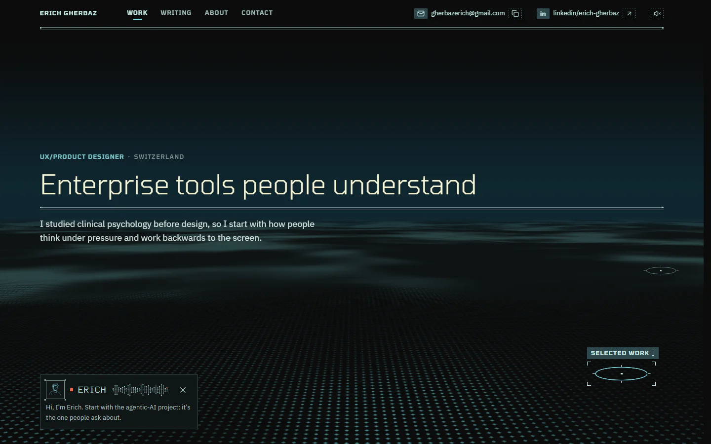
Reading stays still. Motion happens at a change: the camera tilts from the hero down onto the cases, a ring lights once to say there's more below, a diagram draws itself in the order you'd read it, then stops. Sound is off until you turn it on, and with reduced motion every value is simply there.
More detail
The limits I set on motion
Nothing loops on a reading page. The ring's call ends within four seconds, and nothing flashes more than three times a second. A scroll is never taken over: a fast swipe stops at each case once and then lets go.
The sea is a real 3D terrain now, drawn on the graphics card. It loads once the page is idle, and without it the page is the same, flat.
06Working with AI
An AI agent wrote the code; the rules said what good looks like
An AI coding agent wrote the code. I set the standard and judged the result.
I wrote little of the code by hand. An AI coding agent did, working from the graded rules, the tokens and the Figma frames. My job moved from making every screen to setting the standard and judging the result.
The rules became a guide the agent reads first, with scripts and an audit for AI tells.
The rules became a guide the agent reads before any design work, with scripts that measure a screenshot against them. When generic design advice pulled the look back toward a template, the guide won. It also lists the tells of AI-made design, and every screen is audited for them.
It got things wrong; I caught them by looking, on my own screens.
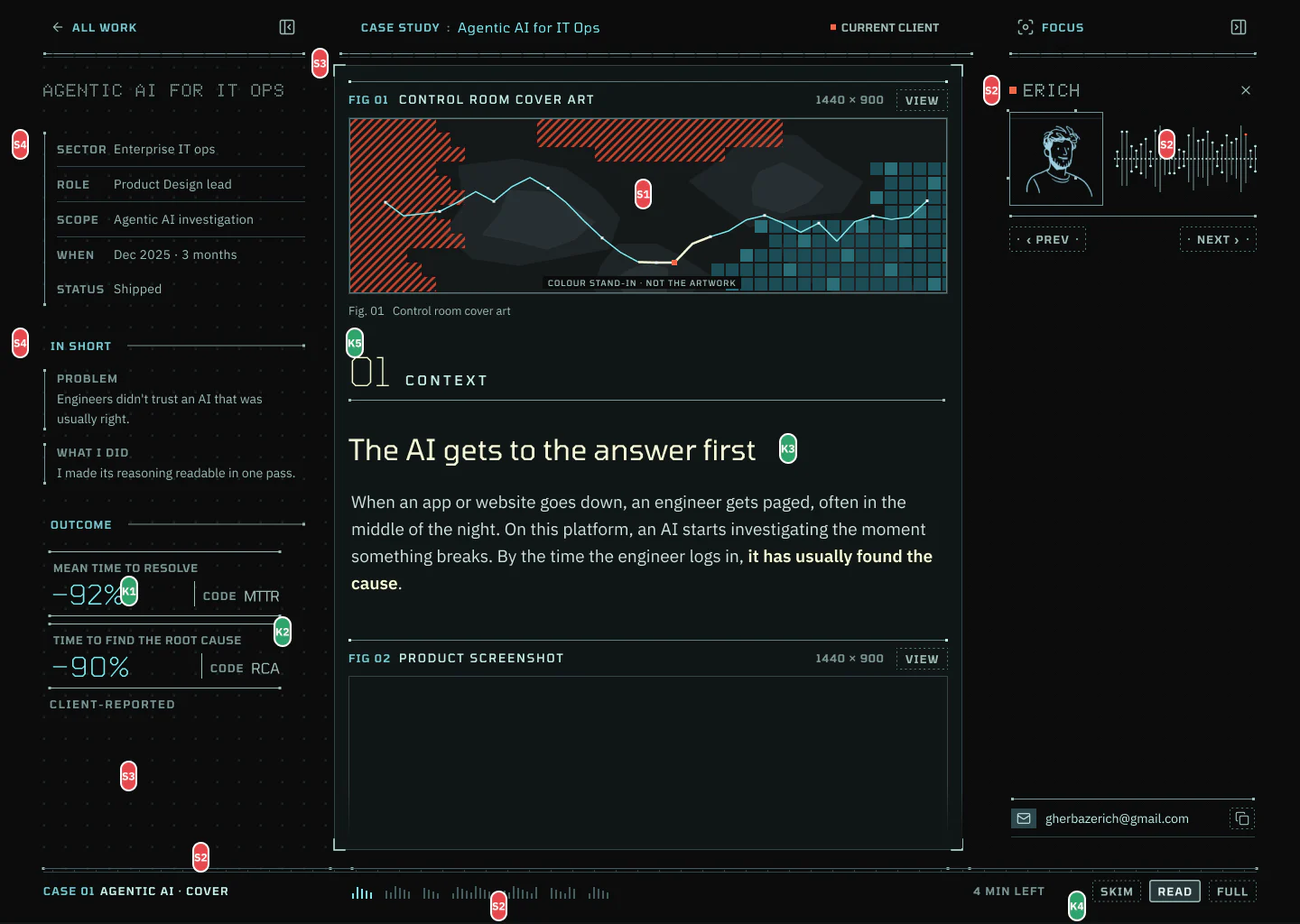
It still got things wrong, and the fixes came from looking. Folders built to the rules looked, in my words, “flat and meh, like we gave up”, so they became real folders, with flaps and the case's screen tucked inside. On my own laptop, the scroll through the cases fought my trackpad; the tests had passed, my hand hadn't.
More detail
How a change gets made
I say what's wrong, in plain words. The agent finds the rule it breaks or proposes a new one, builds the change, measures it and runs the audits: contrast, accessibility, interface guidelines.
I review it on my own screens before anything ships. A rule that turned out wrong is changed in the guide, with the reason, so it stays fixed.
07Impact
The case studies became the brightest thing on the page
Impact · measured on the site
Reading column vs a rail
2.1×
Median
Lowest text contrast
4.77:1
AA 4.5
JavaScript, heaviest page
85 KB
Of 90
Measured, not client-reported. Whether readers follow the cases better is the next test.
No client numbers here; this one is measured. On every screen of this page the reading column holds more attention than either rail, 2.1 times on a typical one. Every text passes AA contrast, the lowest pair at 4.77:1, and the heaviest page loads 85 KB of JavaScript. Whether readers follow the cases better is the next test, with the same readers as before.
A style is a look. A system is the reasons, written down where a build can check them.
Next · Case 01
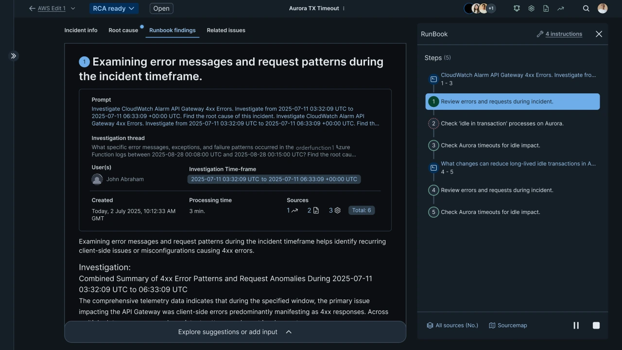
Agentic AI for Enterprise IT Operations
An AI that finds out why systems break. The hard part was getting engineers to believe it.Mean time to resolve
−92%