Case 01 · Enterprise IT ops
Agentic AI for Enterprise IT Operations
In short
Problem
Engineers didn't trust an AI that was usually right.
What I did
I made its reasoning readable in one pass.
Outcome
Mean time to resolve
−92%
MTTR
Time to find the root cause
−90%
RCA
- Enterprise IT ops
- Design lead · sole designer
- Agentic AI investigation
- Aug – Dec 2025
- Shipped
01Context
The AI gets to the answer first
When a system breaks, an AI investigates before the paged engineer even logs in.
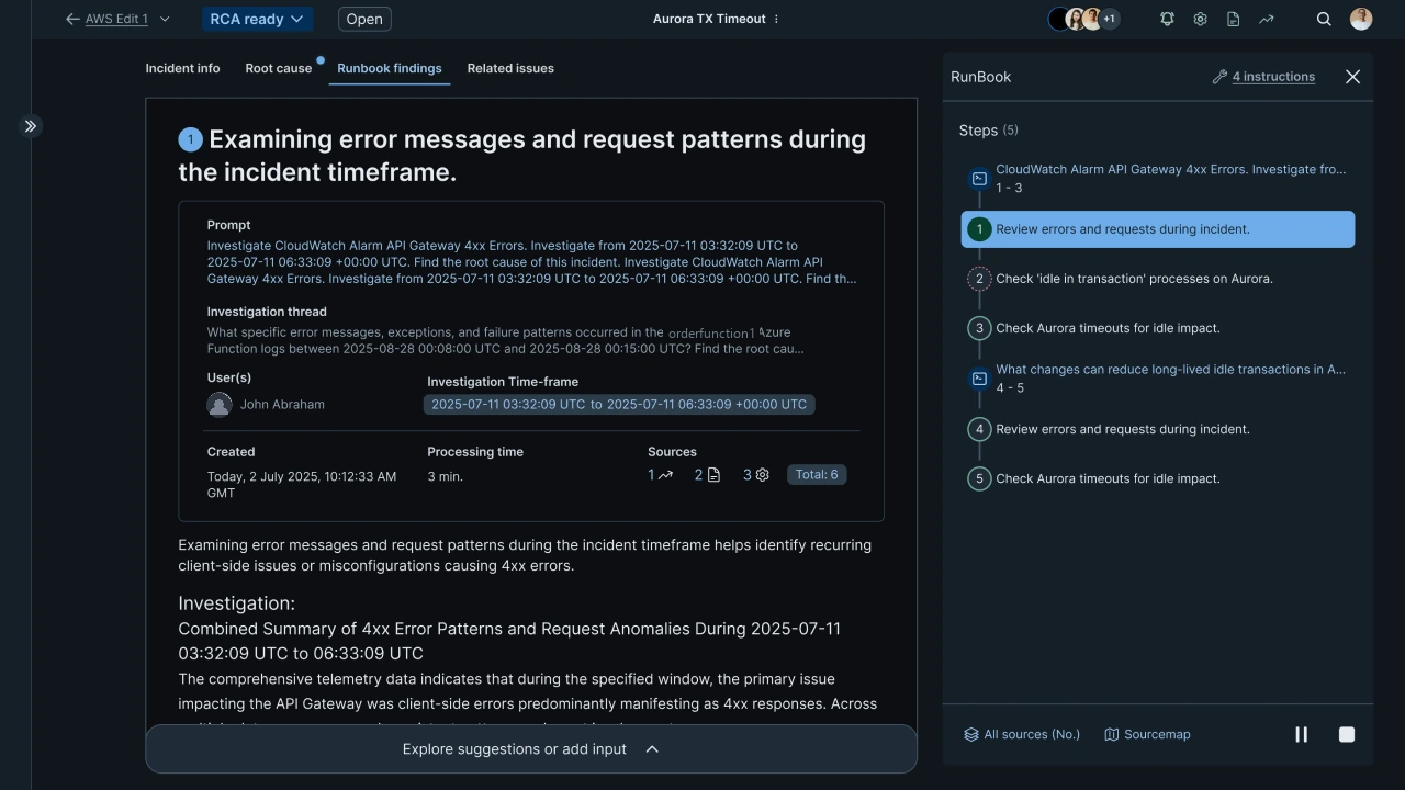
When an app or website goes down, an engineer gets paged, often in the middle of the night. On this platform, an AI starts investigating the moment something breaks. By the time the engineer logs in, it has usually found the cause.
Engineers weren't taking its word for it
27% distrusted correct answers. As the only designer, I set out to find out why.
In the client's data, 27% of them distrusted conclusions that were right, and redid the investigation by hand. The client brought me in as the only designer, to redesign the screens and agree with engineering how they would work. What needed redesigning was how the AI explained itself.
More detail
What I owned
· Framed the problem around trust and explainability
· Defined the IA and reading flow for AI investigations
· Led design decisions balancing transparency and actionability
· Aligned UX with SRE mental models through direct collaboration
· Partnered with engineering on agentic-AI constraints
02The problem
Engineers got lost on the way to the answer
73% of new users couldn't find key sections, and split panels broke the thread.
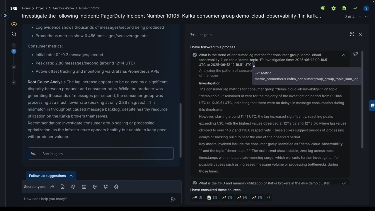
The usage data showed three failures. 73% of new users couldn't find key sections. The reasoning was spread across split panels, so engineers lost the thread. And when reasoning is hard to follow, a right answer looks like a guess.
More detail
Why this is hard to design for
This is a tool for acting under pressure, not for exploring.
· Engineers use it during live incidents, under time pressure and stress
· The AI reasons in many steps, and every step has to stay checkable
· It connects to monitoring tools engineers already use, and couldn't disrupt them
· Trust had to be earned by showing the work, not claimed
· Leadership saw the AI as the product, and the interface as packaging
03The first attempt
Our first fix kept the stepper, and the confusion
Grouping the AI's nested steps inside the old stepper still didn't make clear what was what.
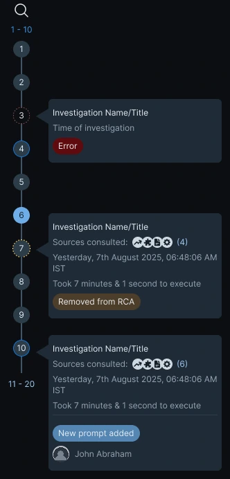
The AI's work was nested several levels deep: each query produced responses, research paths and observations. We first tried grouping them inside the existing stepper, a numbered rail of steps. Without clear labels, it was still hard to tell what was what.
04Decisions
The stepper was doing two jobs at once
It mixed the AI's reasoning with unrelated sections. Other AI tools use a single column.
It was meant to show the AI's reasoning, step by step. But it also held sections that had nothing to do with that reasoning. And looking at other AI tools, the pattern was clear: they present answers in a single column.
So I split it in two
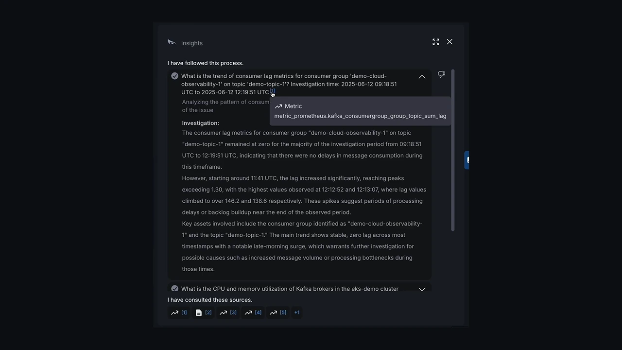
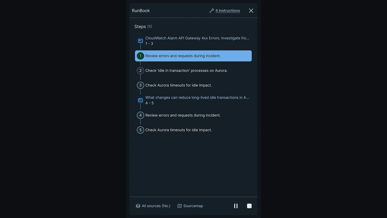
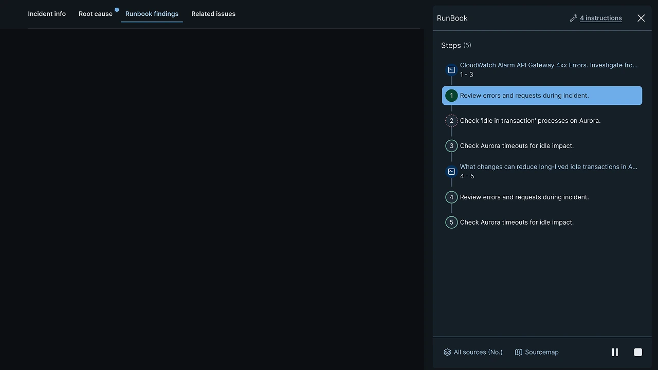
The AI's steps became one runbook-style reading flow. Everything else moved into tabs.
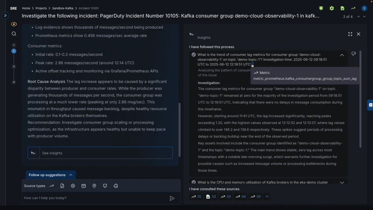
The AI's steps became one reading flow, top to bottom, like a runbook. Everything else moved into tabs. The three failures had one cause, too many places to look, so they got one fix instead of three.
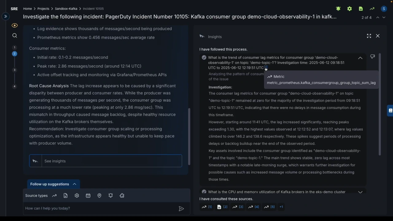
Three findings on this screen. Hover a point below to mark its area on the image; select it to zoom in.Three findings on this screen. Tap a point below to mark its area on the image and zoom in.
More detail
The bet
The problem was never too much data. It was too many places to look. So the redesign kept the same depth and put it in one place. Clean minimalism came second: mid-incident, speed and clarity matter more than white space.
Before: Scroll areas and split panels, with information in several places
After: One reading flow, the same depth, fewer places to look
The new flow ran into the backend
It broke an existing backend contract. Shown the data, the client changed the backend instead.
It changed the format the AI returned, and the backend team objected: an existing contract depended on it. I showed the client the concepts with the usage data behind them. The client chose to change the backend to fit the design.
05The redesign
Now the AI shows its work in order
The runbook
Labelled tabs

One column
06Impact
The product got faster. Design's share wasn't measured.
Impact · whole product
Mean time to resolve
−92%
MTTR
Time to find the root cause
−90%
RCA
Production incidents
−73%
The numbers cover the whole product. One customer said competitors were way behind on experience.
Resolution time fell by 92%, the client reported, but that covers the whole product, not the redesign alone. A customer’s words come closer: “Competitors have strong AI agents, but they are way behind you on the experience.”
More detail
How I'd measure this properly · What I'd do differently
01 · How I'd measure this properly
Overrides of correct answers. How often an engineer discards an AI conclusion that was right. I'd match each conclusion to the fix that closed the incident, and read the overrides from the platform's event log.
Same AI, old and new interface. Split by team over the same period, and compare two things: how often right answers get overridden, and how often wrong ones get accepted.
Where reading stops. Product analytics (Amplitude or PostHog) to see where in the reasoning people stop reading, and think-aloud sessions during live incidents to learn why they override.
02 · What I'd do differently
User access wasn't part of this engagement, so I worked from usage data, research on other AI tools and my own experience. Testing with eight to ten SREs would have shown me alternatives I couldn't see from the outside.
07Role
The AI didn't get smarter. It got easier to follow.
Leadership saw design differently after that. And the paged engineer can now check the AI before acting.
Leadership had seen the interface as packaging around the AI. Customers saying the product was easier to understand changed that. And the engineer paged at night can now follow the AI's reasoning, and check it, before acting on it.
The model didn't change. The gap was never in the model.
More detail
How the details served the goal
· Hierarchy that lets an engineer scan the reasoning in seconds, not minutes
· Spacing that separates what the AI found, what it inferred and what to do next
· Density set for a multi-hour incident, not a first impression
· Consistent patterns, because predictable screens cost less to read under stress
Next · Case 02
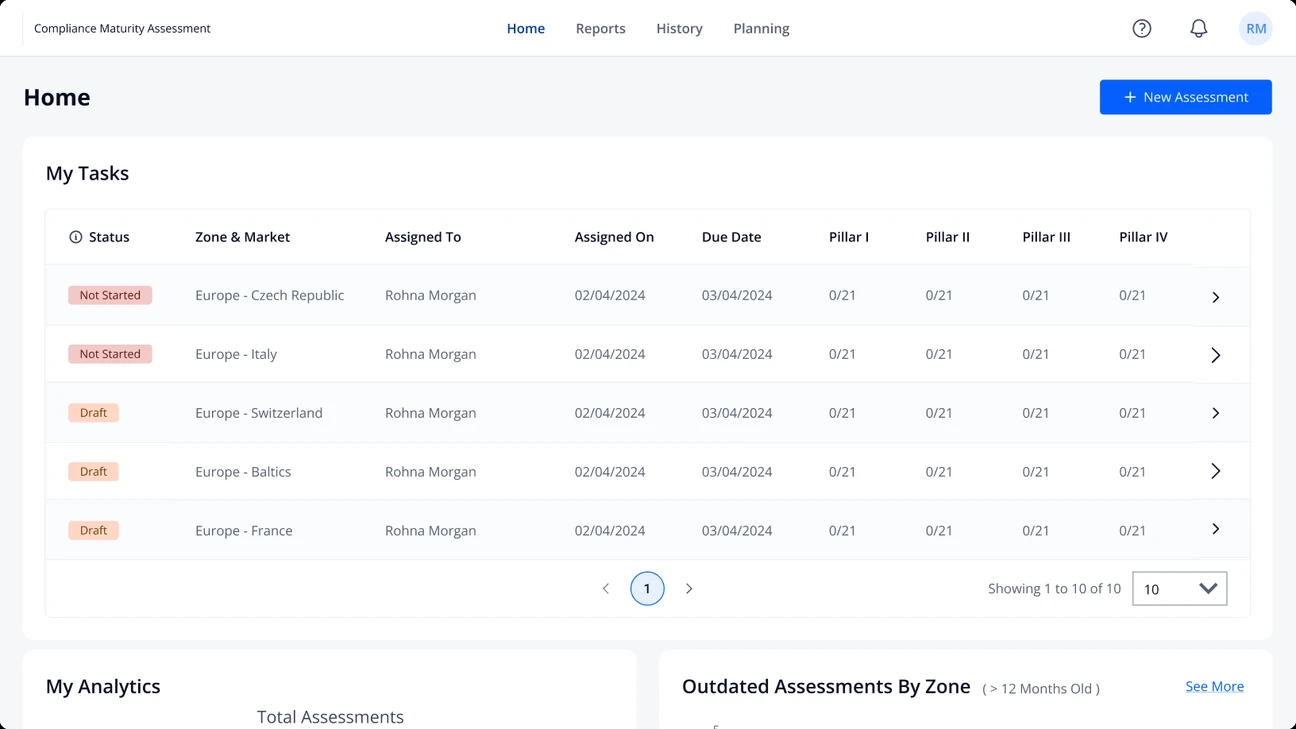
Cross-Market Operations Compliance Tool
A compliance tool that teams around the world had learned to work around.Faster assessments
4×