Case 03 · Fintech
The Sales Part of a Loan Origination System
In short
Problem
Field agents filled 200+ fields from memory.
What I did
I designed an app that knows what to ask for, even offline.
Outcome
Field revisits
−67%
Revisits
Faster loan decision
5×
Decision
- Fintech
- UX/Product Designer
- Lending · Mobile
- Dec 2022 – Jun 2023
- Shipped
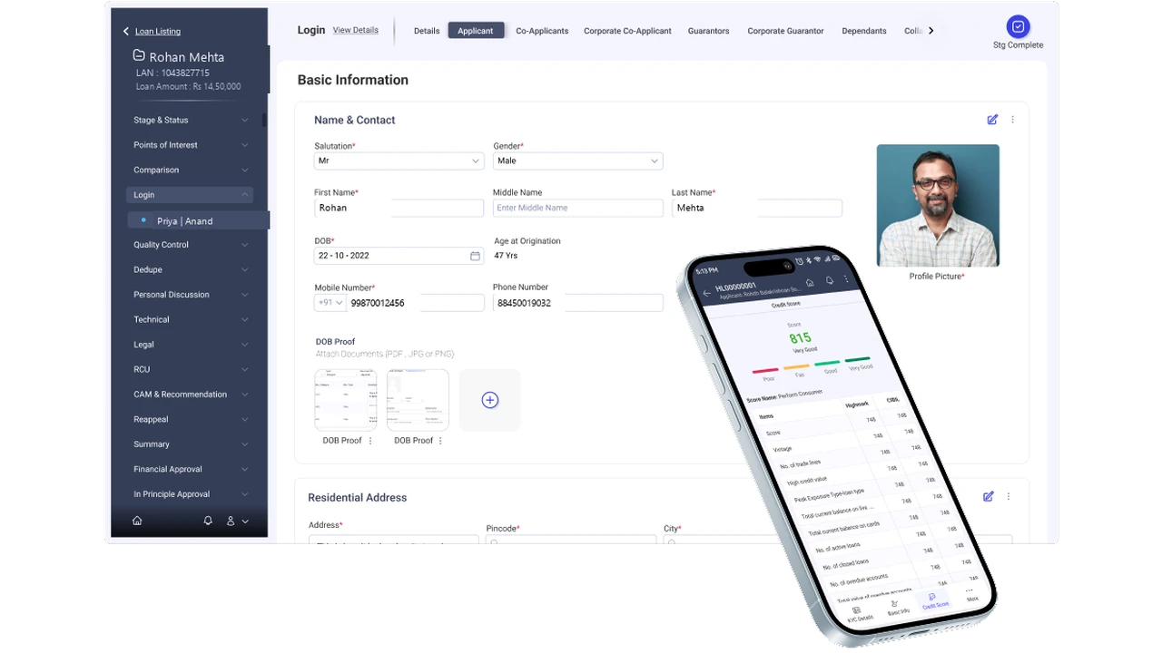
01Context
Every loan starts with 200+ fields on a phone
Agents collect them in person, often in rural areas with patchy signal and the applicant waiting.
A sales agent collects them in person, often in a rural area, with patchy signal and the applicant waiting: identity, address, bank details, documents. Whether the loan moves forward depends on getting them right.
02The problem
The app left agents to remember everything
Nothing was marked required, addresses were retyped four times, and gaps showed up after the agent left.
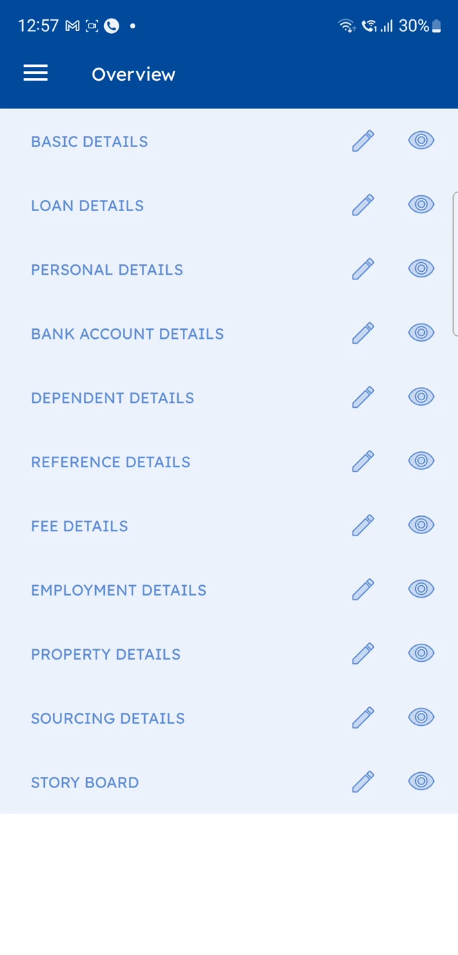
Nothing was marked required, and nothing said which documents to bring. Agents typed the same address up to four times. Missing data often surfaced only after submission, once the agent had left, so they had to go back.
More detail
The constraints
Agents often travelled to rural areas to collect these details.
· A phone in unpredictable field conditions, often with no internet connection
· High compliance risk: nothing specified which documents had to be collected
· Long, error-prone forms with 200+ fields, and the same address typed by hand up to four times
· Agents relying on memory, not on a system that said what was mandatory: basic details, bank details, co-applicant details
· Errors found after submission, not during
Revisits were the symptom. Data capture was the problem.
I designed the mobile app to prevent failures, using findings from a colleague's day shadowing an agent.
A colleague in India shadowed an agent for a full day, and his findings shaped the work. I designed the mobile app, alongside another designer on desktop. The goal wasn't a shorter form. It was a form that stops failures before they happen.
More detail
What I owned
I designed the mobile app the sales agents use; another designer worked on the desktop side of the system.
· Structured the data capture across 200+ data points
· Turned the compliance rules into guidance on the phone
· Designed to prevent errors, not just to speed up entry
· Checked the design against real field behaviour, not ideals
03Decisions
The rules had to travel with the agent
With no signal, a minimum dataset on the phone tells agents what's required and when they have enough.
Agents often had no signal, so the app couldn't check anything with a server. We agreed with the backend on a minimum dataset that ships with the app: required fields, dropdowns, document rules. It made the app heavier, but agents knew when they had enough.
More detail
What the minimum dataset holds
The minimum an application needs, in order:
· Basic details of the customer
· KYC document
· Residency
· Credit score check
With the rules for these on the phone, agents know what's required, and when they have enough.
04The redesign
A 200-field form doesn't have to feel like one
Same number of fields, broken into steps, with fewer decisions for the agent.
I broke it into steps, each built around a failure seen in the field. The number of fields stayed the same. What went down was the number of decisions an agent had to make.
Eligibility first
The app knows which documents
Enter once
More detail
Why the document step matters most
Backend rules decide which documents each applicant needs, and OCR checks each one as it's captured, not days later in review.
That's design preventing regulatory exposure directly, not a usability fix with a compliance side effect.
05What didn't work
But the app couldn't recognise a returning customer
Offline, the app couldn't spot repeat applicants, so deduplication had to be added in a later stage.
Working offline, with the database limits we had, the app had no way to know if an applicant was already in the system. So a deduplication step had to be added later, after the sales stage, to catch repeat applicants.
More detail
What I'd do differently
Give every customer an ID number of their own the first time they enter the system. A returning applicant could give it for another loan, and it would help flag possible fraud.
Some limits only showed up as we built the rest of the loan system: sales was just its first stage.
06Impact
Agents went back to applicants far less often
Impact · whole loan system
Field revisits
−67%
Revisits
Faster loan decision
5×
Decision
The numbers cover the whole loan system, but fewer revisits is what better data capture should produce.
Field revisits fell by 67% and loan decisions got five times faster, the client reported. Those numbers cover the whole loan system, not only the sales stage. But fewer trips back is exactly what better data capture should produce.
More detail
How I'd measure this properly · What the client said
01 · How I'd measure this properly
The numbers come from the client's post-launch report: I didn't run the measurement and can't verify its method. They cover the whole loan system, so the sales stage was never measured on its own.
Rejection reasons, stage by stage. The origination system records why an application was sent back. I'd map each reason to the fix meant to prevent it, and compare. If document rejections fall and address errors don't, the KYC rules worked and the copy-across didn't. A query and a pivot table would give the counts.
02 · What the client said
“Their expertise was evident throughout the process, especially given the complexity of our business. They consistently brought innovative ideas to enhance usability, productivity, and efficiency.”
07Role
The agent no longer has to carry the form in their head
Same 200+ fields, same conditions. The app now knows what to ask for, and when the agent has enough.
The agent still collects 200+ fields, on a phone, often with no signal and the applicant waiting. What changed is where the knowledge lives. The app now knows who qualifies, which documents to ask for, and when the agent has enough.
A form collects what you type. A system knows what to ask for next.
More detail
How the details served the goal
The data was collected on a phone, in the sun, with bad signal and an applicant waiting: conditions that raise the error rate on their own. So the app was built for them:
· A clear input hierarchy
· Thumb-first interaction, with fewer mis-taps
· Progressive disclosure: one step at a time, never all 200+ fields at once
· Designed for the people using it, and the places they use it
Next · Case 04
This Portfolio, Built From Measured Rules
How this site was designed: a film-interface style measured into rules, critiqued, and checked on every build.Reading column vs a rail
2.1×